S3-1: Conduct investigations using the statistical enquiry cycle: gathering, sorting, and displaying multivariate category and wholenumber data and simple time-series data to answer questions; identifying patterns and trends in context, within and between data sets;communicating findings, using data displays.
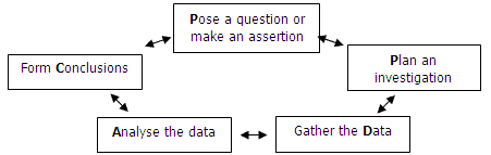
The statistical enquiry cycle has five phases that relate to each other. Some enquiries follow these phases in sequence but often new considerations mean that a statistician must go back to previous phases and rethink. The phases are:
At Level Three students should be able to pose questions that they want to investigate, consider the appropriate data they need to collect, gather and sort the data in order to develop an answer to their question. The data involved should be multivariate so it should include many variables, for example gender, age, height, eye colour, bedtime, etc., so that relationships between the variables can be explored. Students should be able to ask summary questions (of a variable), for example what is the usual range in height for 10-year-old students?, comparison questions, for example are girls taller than boys?, and relationship questions, for example do older students go to bed later than younger students? Data displays, including tables and graphs, expected at Level Three are tally charts, frequency tables, pictographs, bar graphs, strip graphs, and pie charts for category data, dot plots and stem and leaf graphs for whole-number data, and simple line graphs for time series data. Students should be able to use computer technology to create these displays to find patterns, including trends over time, in data as well as to communicate their findings to others. They should be able to justify their choice of display/s with reference to the patterns they wish to highlight.
conduct a survey
collate survey data
create a graph
interpret findings
interpret information from a graph
write an investigative question
collect and collate data
display data on a graph
make conclusions
decide which graph is most suitable to represent the data
answer questions from a table
collect and display data
compare data groups and make conclusions
Students will:
- gather and record category data and investigate features of the data
- interpret data displays and draw conclusions from graphs.
Students should discover that:
- there is only a weak relationship between volume, mass, or product type and how it is packaged.
- Display collected data in an appropriate format.
- Produce bar charts of data using Microsoft Excel.
- Plan a statistical investigation.
- Make statements about implications or possible events based on selected data.
categorise data
calculate percentages
construct a graph
make a conclusion from the data
construct a time-series graph using a computer
evaluate statements made about the data
interpret data shown on a pie graph
show fractions on a pie graph
find all possible outcomes
Students will:
- gather data on how long it takes for various items to decompose
- represent data on a timeline
- draw conclusions from data.
Students should discover that:
- patterns can be found in data
- these patterns have meaning.
Students will:
- measure, record, and average data for 2 variables (number of marbles and bungy cord stretch)
- plot a scatter graph using appropriate scales (independent variable on x-axis [number of marbles]; dependent variable [overall length] on y-axis)
- use tables and graphs to identify patterns/300
measure distances
measure times
record data on a graph
interpret patterns from the graph
- Plan a statistical investigation using the PPDAC cycle.
- Choose an appropriate data display (bar graph, dot plot, time series graph).
- Make statements about the findings of the investigation.
write investigative questions
make a conclusion
interpret statements made about a tally chart
discuss what information the stacked bar graph bests shows
pose questions for further investigation
construct a time-series graph
answer questions from graphs
make conclusions from own investigation
Students will:
- read a linear scale on a thermometer and record temperatures
- plot 3 series on a time-series graph.
Students should discover that:
- the slope of the graph (which represents the rate of change) is different for each tin
- temperature change is proportional to volume (the larger a volume of300
- Recognise what the variables are in a secondary data set.
- Sort the given data into categories.
- Answer investigative questions by sorting, organising and arranging data.
- Make sensible statements about the data with supporting evidence.
construct a tally chart
construct a bar graph
describe the features of a data set
write investigative questions