This is a level 3 and 4 statistics activity from the Figure It Out series.
A PDF of the student activity is included.
Click on the image to enlarge it. Click again to close. Download PDF (1336 KB)
find all possible outcomes
graph the outcomes from a simple probability experiment
compare theoretical and experimental results
This diagram shows the areas of Statistics involved in this activity.
The bottom half of the diagram represents the 5 stages of the PPDAC (Problem, Plan, Data, Analysis, Conclusion) statistics investigation cycle.
A computer spreadsheet/graphing program
FIO, Levels 3-4, Statistics Revised Edition, Dylan's Dominoes, page 24
Classmates
In this activity, the experimental → theoretical progression that is typical of probability activities is reversed: the students start with a theoretical model, use it to make predictions, and then see how experimental results conform to the predictions. They will fi nd that the experimental results vary widely from group to group, providing an excellent example of variation at work.
Once the students have determined that cups are needed for each dot total from 2 to 12, they may initially assume that all the outcomes are equally likely. Question 2 is designed to challenge any such assumption and provide a rationale for a prediction.
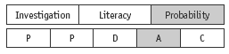
The most convenient way of setting out all possible outcomes for the roll of two dice is in a 6 × 6 table. If your students have done the previous activity (The Unit Fraction Game), they will have encountered a similar table there. If they have not come across this kind of table before, they may need some guidance. The Answers show the completed table.
The table clearly shows, for example, that there are more ways of getting a total of 7 from the roll of two dice than there are of getting a total of 2. Even when students see this, they may fail to realise its significance, mistaking multiple instances of an outcome for repeats (for example, believing that 3 and 4 is the same outcome as 4 and 3). This error is more likely if the dice used are indistinguishable so, if possible, use dice of different colours: a red 3 and a yellow 4 is likely to be recognised as different from a red 4 and a yellow 3.
It will be helpful to graph the information from the table as a bar graph. This will show the pyramid-shaped data distribution that the mathematics would lead us to expect:
For question 3, a dot plot or bar graph are both suitable, but if a number of different groups are doing the activity, creating a sizeable pool of data, the students are likely to find that the best option is to enter the data in a spreadsheet and then create a bar graph. They can then compare the shape of this graph with that of the theoretical model above.
Encourage different groups to share and compare their graphs. The students are likely to find that they vary widely. It is important that they think about why this is and that their thinking contributes to a growing appreciation of what is meant by variation.
In question 4, the different groups pool their data. When graphed, the result is likely to conform more closely to the expected pyramid shape than did the graphs of the data for the individual groups. It is nevertheless entirely possible (as a result of variation) that an individual group has a better pyramid than the combined groups.
Data from a computer simulation
For your information, the following table contains 10 computer simulated sets of data for this activity, each consisting of 200 trials. Each column contains the data for one set of 200 trials. From the table, it can be seen, for example, that the two dice gave a sum of 2 eight times in the fi rst set of trials, four times in the second set, never in the third set, and 61 times in the entire set of 2000 (10 × 200) trials.
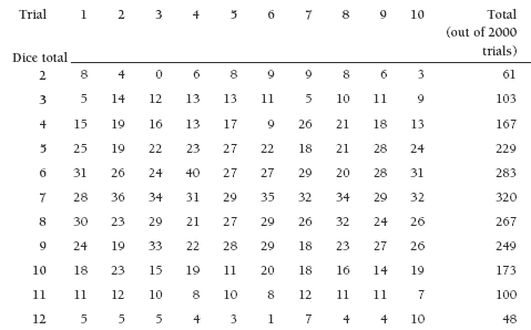
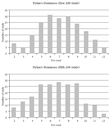
The following two bar graphs, for the first and fifth sets of 200 trials, show how different the results can be, even with a reasonably large pool of data.
This final bar graph shows the data for all 2000 trials, together with (outlined bars) the theoretical expectation for ease of comparison. It can be seen that the data now conforms very closely to the expected pyramid shape.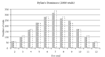
If wished, you could share some or all of this data with your students for their own explorations.
Answers to Activity
1. 8, 9, 10, 11, and 12 are missing.
2. a.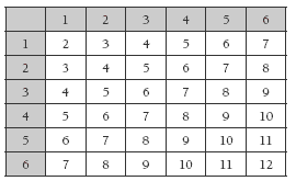
b. 6, 7, and 8. There are 6 ways to get a total of 7 and 5 ways of getting either 6 or 8. There are fewer ways to get any of the other totals.
3.–4. Practical activity. A bar graph or a dot plot could show your results clearly. Conclusions will vary.
Key Competencies
Dylan’s Dominoes can be used to develop these key competencies:
• thinking
• participating and contributing.