Reach for the Sky
This is a level 5 number and statistics activity from the Figure It Out theme series.

Click on the image to enlarge it. Click again to close. Download PDF (432 KB)
find percentages of decimal numbers
show data on a graph
calculate mean, mode, and median of data
FIO, Levels 3-4, Theme: Sport, Reach for the Sky, page 16
A tape measure
A metre ruler
Classmates
Ask the students how they can use their own measurements to work out the likely back and waist-to-knee measurements of the Nikau Knights. If they work out what fraction (or proportion) of their own height their back measurement is and what fraction of their own height their waist-to-knee measurement is, they can use these fractions to work out the measurements of the Nikau Knights.
The students will need to gather data from at least 10 other students in order to estimate what proportion of their total height their back and waist-to-knee measurements are.
For example, for the back measurements: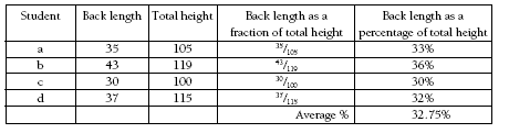
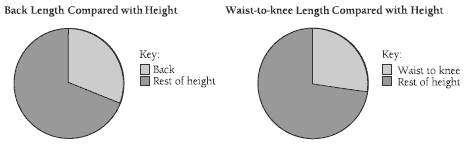
Because this problem involves proportions, the students will need to use a graph that emphasises proportions of a whole. A pie or strip graph will do this.
Below are two pie charts showing how the data could be displayed:
For question 2, the heights of the basketball players are deliberately skewed to prompt students to consider which statistic, the mode, median, or mean (average), gives the best indicator of a team member’s expected height. Comments on the appropriateness of each statistic are provided in the Answers.
As an extension to question 2, you could ask the students to work out what the back length and waist-to-knee measurement of the uniforms should be.
For example, using the mean, 1/3 of 1.96 is about 65 centimetres (back) and 1/4 of 1.96 is 49 centimetres. The uniforms need to fit all the team members, so the students may decide to make the shirts and tops a little longer than the average measurement.
Answers to Activity
1. a. Practical activity. Answers will vary.
Teacher to check
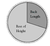
b. Graphs will vary. In this case, a pie graph or a strip graph are good for showing
approximate proportions as an overall trend. For example, a pie graph of the
average measurements of a group of classmates on a 100 circle could look like
this:
This could be shown more easily as a strip graph:
![]()
2. The mode is the most common height. In this case, there are a small number of measurements with no most common measurement, so the use of a mode is inappropriate.
The median is the middle number when they are placed in numerical order:
1.75 1.80 1.91 1.92 1.93 2.00 2.10 2.11 2.15
The median in this data is 1.93 m.
The mean is found by totalling the measurements and dividing this total by the number of measurements:
1.75 + 1.80 + 1.91 + 1.92 + 1.93 + 2.00 + 2.10 + 2.11 + 2.15 = 17.67
17.67 ÷ 9 = 1.96 m
The median and mean are reasonably close, so they both give an indication of where the middle is.
(You may decide to make the shirts and tops a little longer so that they fit all the team members.)